As much as experts, analysts, speakers, lecturers and consultants keep hailing whatever the current year is the year of Customer Experience, UX fails are still everywhere.
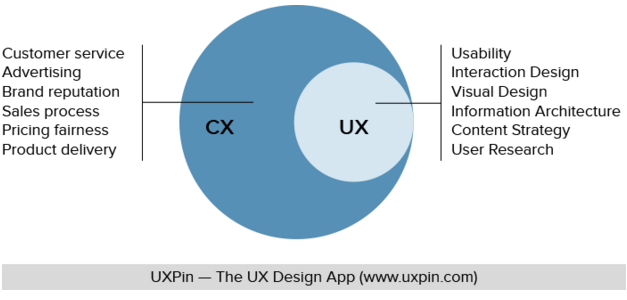
Although user experience (UX) is only a part of customer experience (CX), its impact on the bottom line can be significant over the long run.
That’s why startups and innovative companies have been wooing customers away from incumbents with superior UX and UI.
As a user, I’m angry that bad UX is still happening in 2018. As a market observer, I’m concerned for the big corporations that are letting things slip past the cracks.
Now let’s dive into the list of UX fails that I’ve encountered from a variety of industries. These UX flops can range from mildly inconvenient to downright frustrating.
Banking and Finance
Recently, I wrote a fairly extensive post on the digital disruption coming to banks and touched on the topic of UX by zooming in on ING Australia.
Continuing that thread, I don’t understand why some financial institutions still put out digital experience that felt like it belonged in your Grandma’s era.
1. Virgin Money
I had been frustrated by not being able to press enter to log in after typing my password on the Virgin Money website (always had to then manually drag my mouse to click “Sign On”). Why the friction?
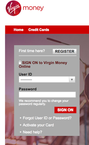
Finally, I discovered the reason. I was using Firefox on MacOS, which isn’t in their list of supported browsers.

Look at how limited it is. Their reasoning to stop supporting outdated browsers or operating systems is to ensure the “highest standard” in data security. Fair enough.
But if you look at the image again, it seems Windows 7 - released in 2009 - is “winning” here. While Microsoft is hoping to end Windows 7 soon, Virgin Money is telling everyone to get Windows 7 to have a surefire chance of being supported by their website.
Next, their virtually non-existent mobile app. Why do I say virtually non-existent? Have a look at this next screen from the App: You won’t be able to use it without calling their Customer Care Team to get a secure token!
 Talk about friction: users get an app so they don’t have to go to or call a bank.
Judging by the user rating of 1.1 out of 5 on the App Store, the Virgin Money app has a loooong way to go (which is funny because they actually put out an update to support iPhone X face ID – talk about priorities).
2. HSBC
Check out the online sign-up process for an account at HSBC.
After filling in an ugly online form, you have to print out two other forms, complete them, find a suitable referee to sign your form, and believe it or not, post it to them (see image).
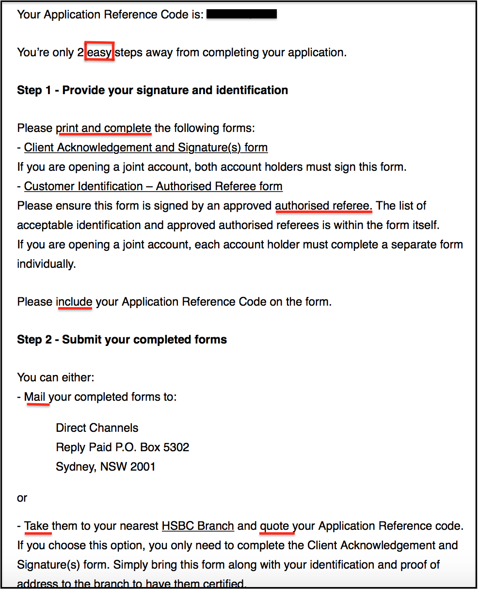
Which era are we in? Especially after being exposed to the better UX by other financial institutions and fintech startups, this is off-putting.
3. Commonwealth Bank of Australia
I’ve mentioned CBA in my previous post when comparing the big banks’ mobile apps with ING’s. Now here are two of my pet peeves when it comes to the CBA app.
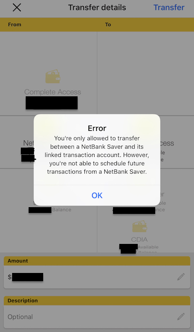
#1: I can’t set up a recurring transfer from my savings account to my normal account in the CBA app.
Granted that it is a function not yet supported by CBA, why not prevent users from going all the way to the final step - after choosing start/end dates, payment frequency - only to see this error message?
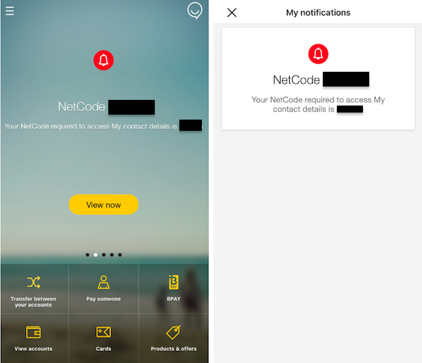
#2: The security code notification just won’t go away. Usually, you get this as a security measurement if you want to add a new payee, change your personal details etc.
There’s no way to dismiss it on the screen or even after logging off or quitting the app altogether. Okay, this might not be a UX fail per se. But if you’re have a notification OCD like me, that could get on your nerve (!).
Logistics
Australia Post
Warning: a lot of venting ahead. This is my experience when AusPost lost my parcel by “safe dropping” it to the wrong address.
Aside from how long it took (19 days) and how many hoops I had to jump through to get my missing item query resolved (in a less than satisfactory manner), their online support portal is not that user-friendly.
UX fail #1: following up on a lodged support request
After being logged into MyPost, I clicked on Help and Support, which took me to a new tab that apparently required me to log in again (see image). Clicking on that Log in link took me to yet another tab with a list of my enquiries.

UX fail #2: half-hearted feedback seeking
Why the limited character count in feedback form? As if they don’t want customers to list all the problems with Australia Post.
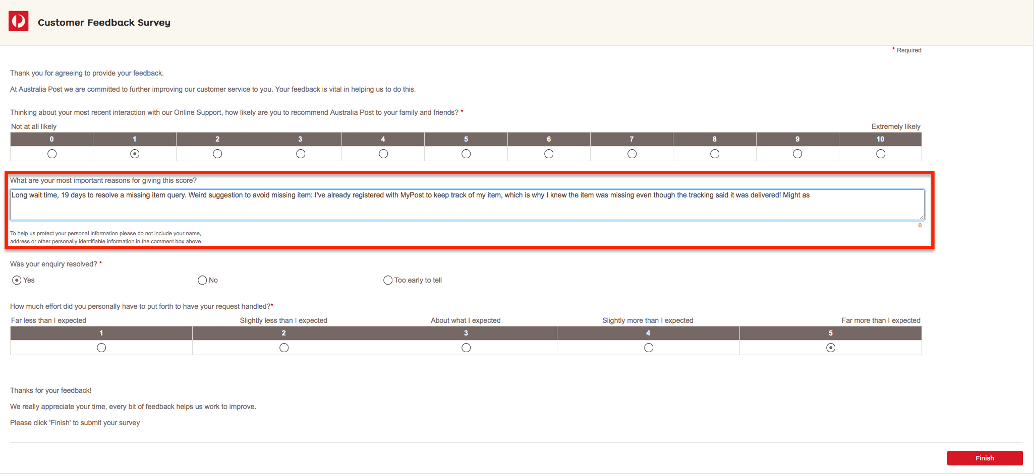
I had to cut off my sentence there, which should have continued with: “might as well suggest the “Safe Drop” parcel feature when no one is home is not reliable and shouldn’t be used.”
Target – who was the retailer that sent the parcel – dealt with my issue in a much more organised and empathetic way. Don’t be like AusPost, be like Target!
Public services
ASIC
This wouldn’t be complete without mentioning a government body’s digital user experience. Australian Securities and Investments Commission’s website is where you go to update business registration details.
Take a look at this screen to update an address.
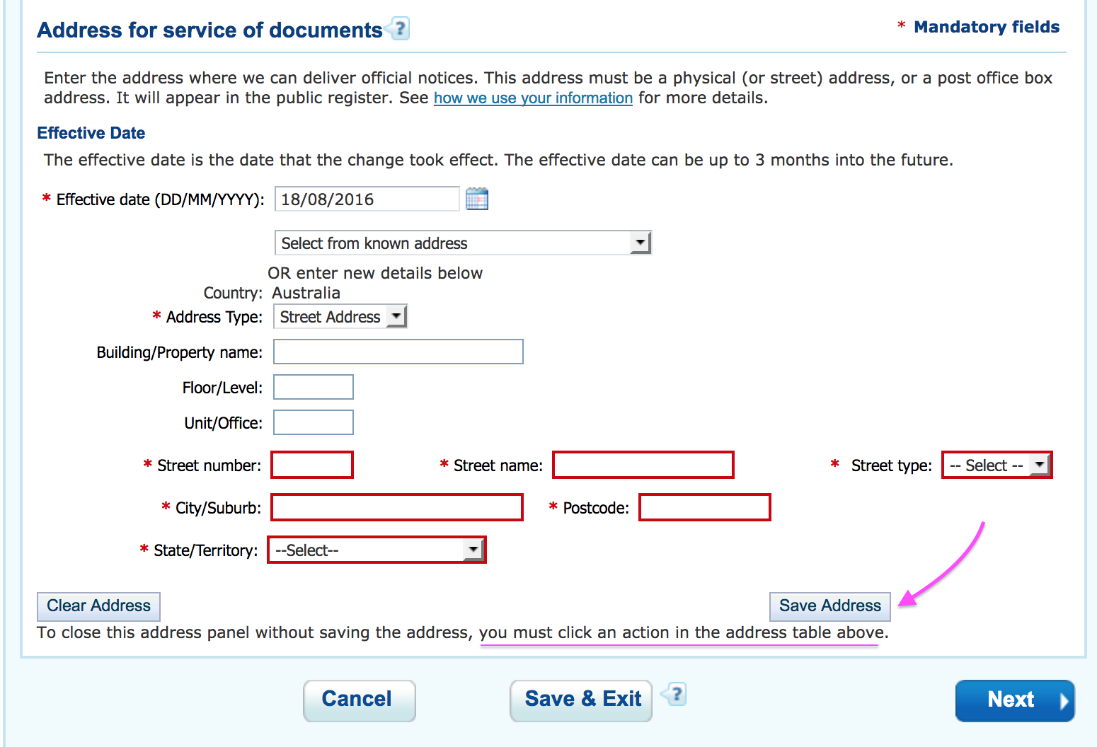
Firstly, you have to manually type in each address field. This field-by-field way to record your address is very much akin to how you’d do it on paper. The lesson here is: digital is not simply bringing an entire paper-based process online.
Alternatives:
- Drop-down auto-complete address field
- Or simply one single address field
Secondly, you’d click the blue button Next after filling out the address as a natural reflex (or because it’s the most prominent label). Guess what? Doing that won’t save your address, you’ll lose all the hard work you’ve put into filling out all of those fields.
What should you have done? Click that small button “Save address” then Next.
To avoid user frustration, there should be a “Save and next” button instead of two separate buttons.
Also, what is the instruction (underlined in the image) even useful for? I pretty much can do that by clicking “Cancel” or “Next” - which are all below the address table.
Media & Publishing
1. Enterprise Connect
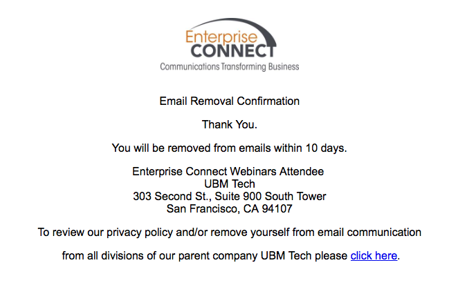
For a website that talks about cutting edge enterprise IT and technology, this processing speed of email unsubscription seems on par with how a paper-based government body processes a query.
2. CMO.com.au
This is what happens when you don’t moderate article comments but have them shown on every page as a sticky element.
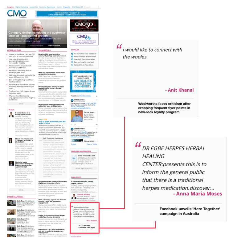
The initial idea could be to give readers the impression of high content engagement. So yes, there’s high engagement, but high relevance? Probably not.
B2B Marketing
When it comes to B2B, there seems to be a negative correlation between the pleasantness of UX/UI and the size of the target audience’s organisation.
In other words, products that target more enterprise-y people tend to have more complicated, convoluted, or “ugly” user interface.
1. SlideShare
Firstly, the search function seems broken. All the search results are the same no matter which page of the search results page you’re on. See the video below.
Secondly, analytics for the slides are different on the My Uploads tab and Analytics tab.
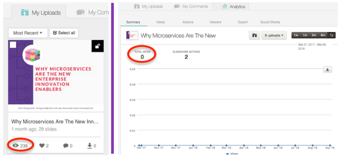 Analytics of the same slide shown as different stats on My Uploads (left) and Analytics tab (right)
2. HubSpot
This is where you go to unsubscribe or edit your email subscription preferences.
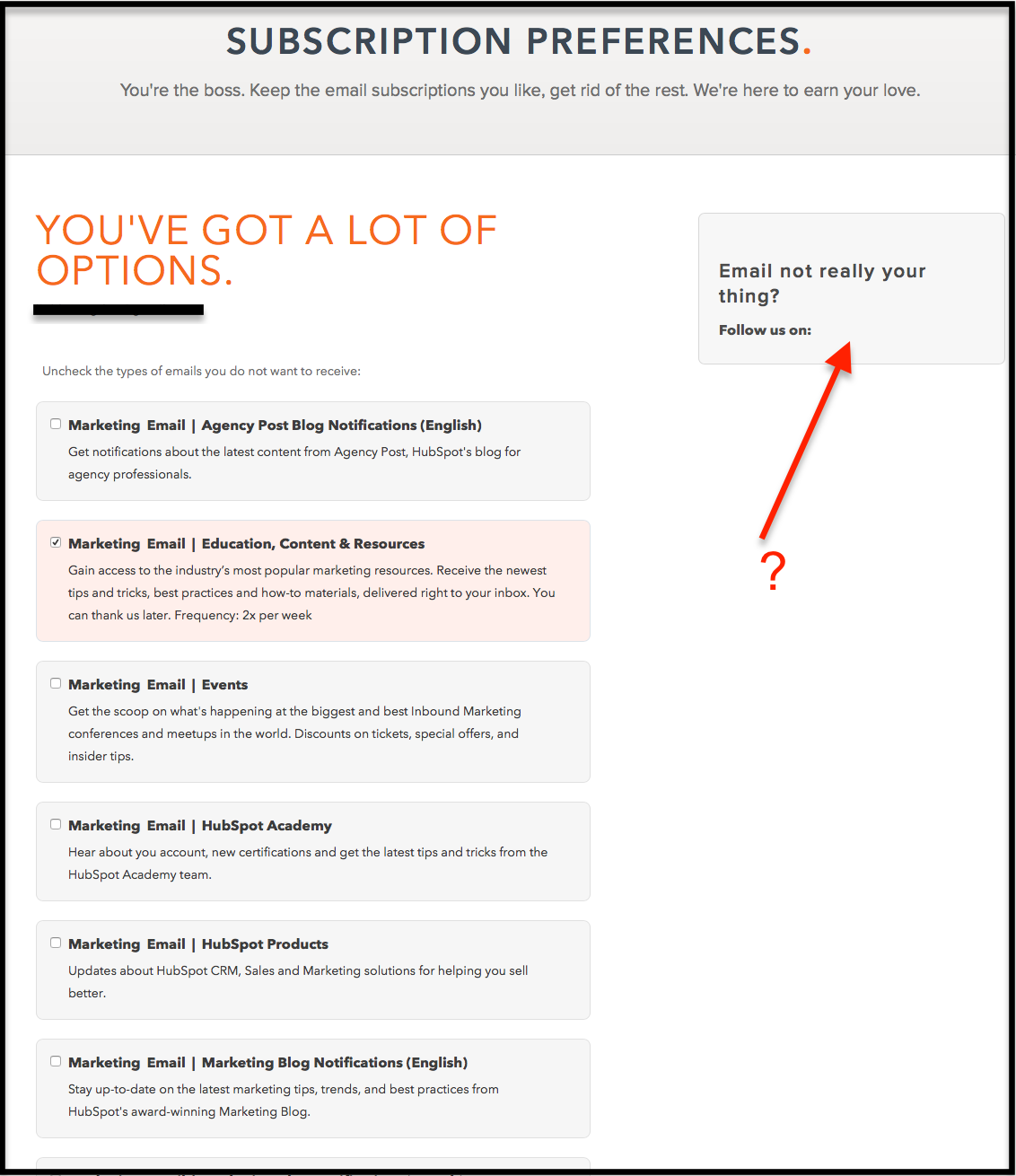
The only thing that HubSpot gets right after making me scroll through an impressive list of 29 types of emails, is yes, users have got “a lot of options.” The button to unsubscribe from all emails is buried way down the page.
Also, the social media icons are missing after the call-to-action “Follow us on”. For a marketing automation software company, this is pretty weird.
Getting lost in the Google jungle
Google is huge. So huge that you might feel different components of the same Google product are made by different companies.
I can list a lot more but let’s just pick the following Google products.
Online branding for business
This is my experience dealing with this suite of products: Google+, My Business and About me.
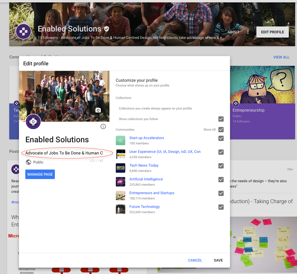
From the Enabled’s Google+ Page, clicking on “Edit profile” triggers a pop-up which has “Manage Page” on it. Clicking that leads you to an About me page (in a different tab). Still can’t edit profile at this stage.
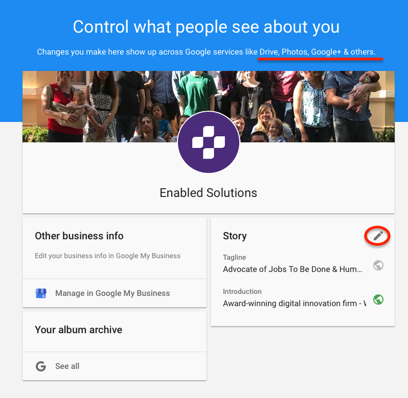
On that About me page, there is an option to “Manage in Google My Business” which unsurprisingly triggers a new tab where you can edit local business info like opening hours, description, contact info etc. OK but where do I edit the Google+ profile?
Something is unnecessarily complex here. Let’s rewind a little.
It turns out:
On Google+: You can edit your 140-character-long profile here => There should be a clearer indicator for that action on this page.
On the About me page: You have to click the pen to edit your “Story”. The funny thing is, Google says changes made on this page will be reflected on Google+ (and others?), which is not the case.
On Google My Business: You can edit yet another piece of profile information that shows up when someone search for your business on Google.
What can be done here? One word: streamline.
Bonus UX fails that apply to many brands
1. Disconnection between different parts of Customer Experience
This happens when a business sees UX as a separate “thing” that is not integrated with the whole CX as shown in the image below.
Applying for a financial product online:
Very often, you’d need to get in touch with the physical branch, and also very often you’d hear something like “Oh the online department is separate, you’d need to get in touch with them directly.” As if they don’t work for the same company after all. This sometimes applies to a retail setting as well.
Email/online interactions and physical mail are out of sync:
Have you ever received a physical letter days after you’ve completed or they’ve completed a certain action and it’s no longer relevant?
Examples:
- A letter saying I need to upload/send verification documents after I’ve received my new credit card
- An email saying my new membership pack will arrive soon after I’ve already got it in the post.
Most of the times, these out-of-sync events are not disastrous but they can accumulate in the customer’s mind and weaken a good brand’s value.
2. Content automatically loads when scroll down
Infinite scrolling is the worst, especially when you’re looking to get to links in the footer. Why is it annoying? Infinite scrolling takes away control from users and can leave them disoriented. So use it appropriately or don’t do it at all.
From an ethical standpoint, infinite scrolling is questionable because it makes users engage with the product longer, tapping into addictive behavioural patterns in the digital era. This is why we’ve seen the defensive push around Digital Wellbeing recently from Google and Apple.
Why do these weird UX choices still exist?
Either these organisations are:
- Aware of the issue yet do not have the incentive to change (monetisation, advertising, politics)
- Unaware (insufficient user research)
- Aware but do not know where to start (conflicting info, limited resources, organisational barriers)
Towards delightful UX
As with any benchmarking, there’re multiple levels of UX maturity. Check out this UX pyramid:

Most of the examples in this post stop at the Usable level. But some even stop before the Functional level. So they’re far far away from the “delight” level, which includes things like microcopy, microinteractions, animations, etc.
Meanwhile, a lot of companies are seeing that high level UX is actually worth money. How? Because having less friction and delighting customers, leads to more customers, who stay around for longer, and recommend you to even more potential customers.
At the end of the day, who would you buy from?
- A company that makes you print 2 forms, buy a stamp and wait 10 days
- A company that lets you get the job done by getting into their app right away
What next?
If you want to learn more about delightful mobile UX and UI, check out our previous post 10 Plus 1 Commandments for the Modern Mobile App Designer.
Or if you want Enabled to audit the user experience of your app, website, or digital product, drop us a line.

