We made a cool new app. Seriously, look at it, it’s so cool
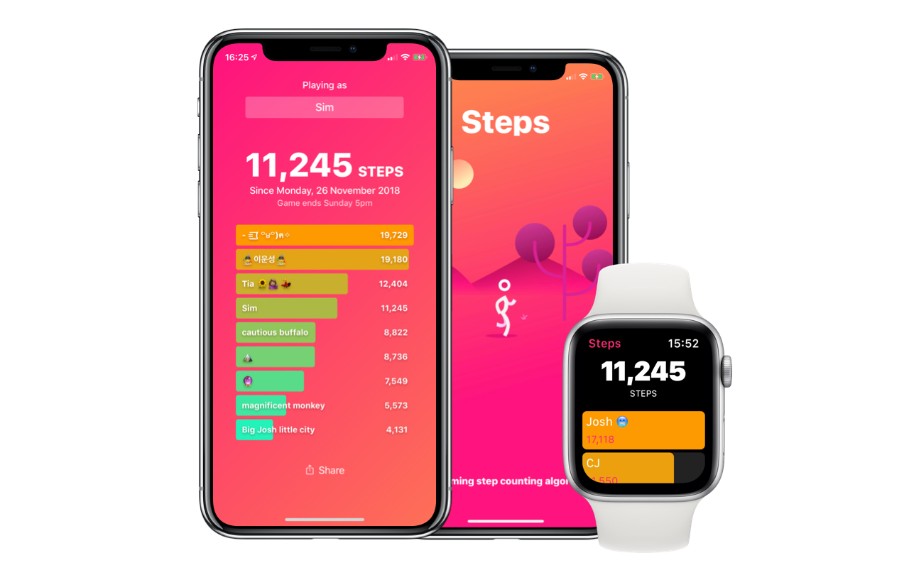
TL;DR Our weekly step competition app has opinions. Get it here
Steps pits you against your friends in the simplest ever weekly step count competition
It started life as an app for us Apple Watch fans in the office to tally our steps and compete with those Fitbit ~jerks~ friends
Then I wanted to learn how to put a server in the cloud and make the steps beam up and back down onto everyone’s iPhones. I started on glitch.com and made the roughest, quickest, dirtiest bit of code I could write. And it worked! Not just technically, but we actually started using it to compete with each other. Everyone got in on it
We even wrote an Apple TV app to broadcast the live results of our game
(Take a photo of the TV that is 5 meters away from me seriously why am i so lazy)
Josh, our designer, made a great icon
![]()
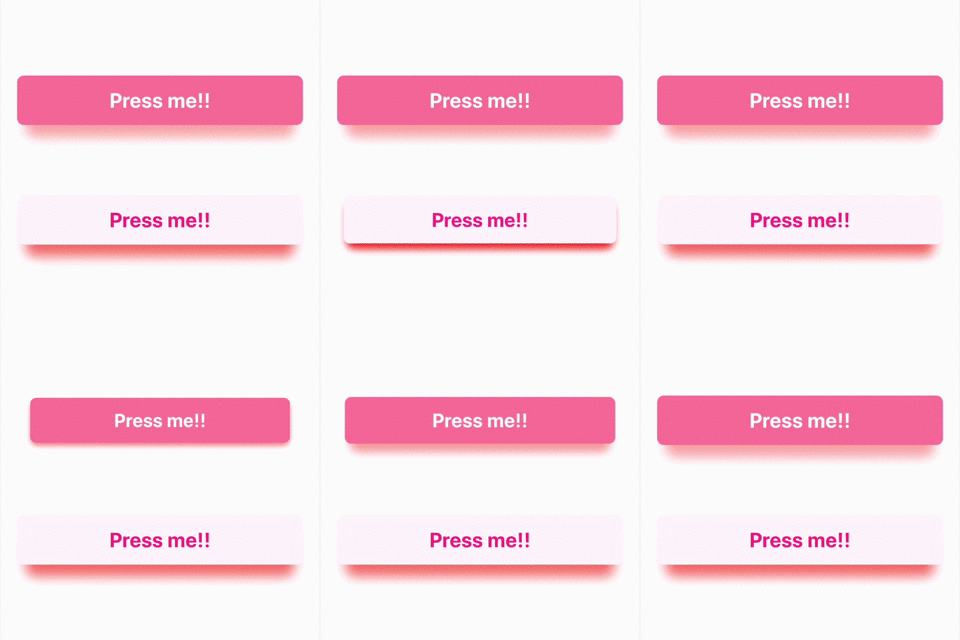
Unsung, our iOS developer, made our 3D button code
And then John and Dylan, our people who actually know what a cloud is (what is it?) helped me make the server properly using CloudKit
Ground rules
I had rules about how this app had to be
First: No analytics
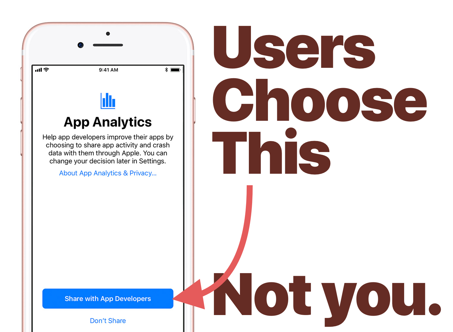
I was often advised by our cloud gurus to, “Use Firebase. It’s so much easier than CloudKit.” While that is very true (oh my god it’s so true), the convenience meant handing over our users’ data, and who knows what else, to Google. I wasn’t prepared to ask our users to do that and I wasn’t prepared to do it without their permission. However few of them there were going to be
Users had already decided whether they were opting-in to analytics when they set up their iPhones. To respect that choice there would be no tracking
Bold choices
This app had to be simple. I didn’t want sign-in, but I wanted a multiplayer experience. I didn’t want features, I wanted fun
Let’s take a look at the on-boarding screens in Steps. Each one clearly explains its value to you. The button to make it go away is big and bright
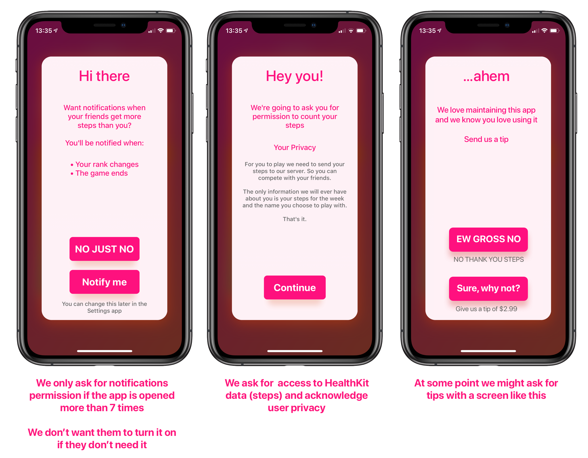
When we ask for your step count data we tell you exactly why we need it and what we will store
We don’t ask you if you want to enable notifications until you have opened the app seven times. Why? Because if we see that you keep checking the app then you might actually want notifications. I thought seven seemed like a good number of times to wait. There is no empirical data to back this up
Strong voice
Steps has big, bright, in-your-face colours
The colours alone make competitions in our app much more fun than any competing app, and its simple design led to fun competition
For example, in Steps, you can change your name at any time and it doesn’t need to be unique. People changed their names to emoji. They changed their names to other people’s names. Then there was that time everyone decided to change their name to “Hi Harrison” because it annoyed Harrison
Sometimes people changed their name because they were losing, or maybe they were winning (sorely). It turned out that the simplicity of assigning names led to inside-jokes and creativity in how they were used
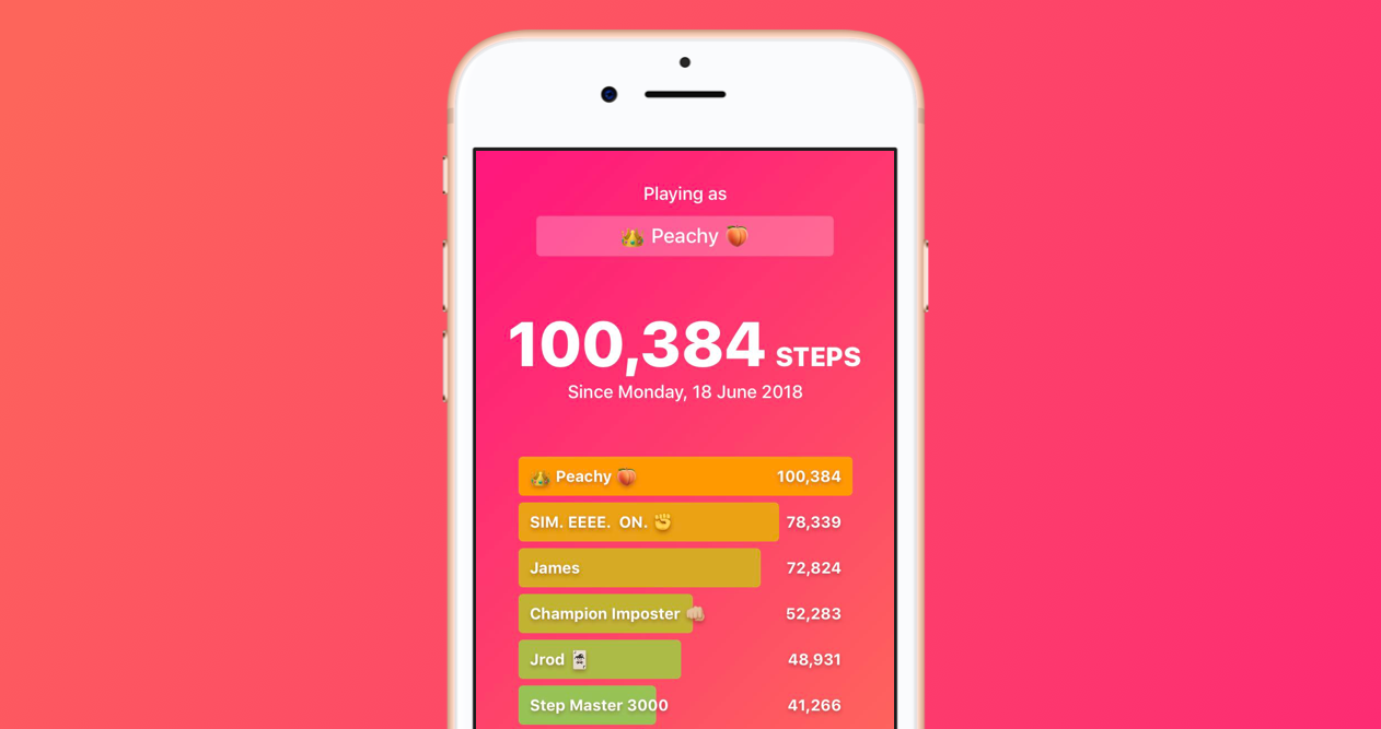
Here’s our game from that time Courtney hit 100,000 steps (how the hell)
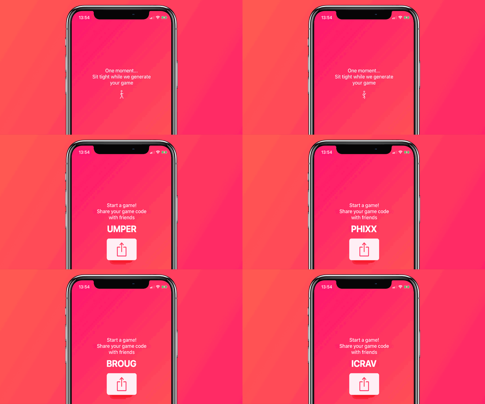
We put a lot of attention into places you wouldn’t expect. Like, how do we generate game codes? I wanted aesthetically pleasing game codes, not just random numbers and letters. I wanted nice looking letters, and even nice sounding sequences of letters. Take a look at the image below cycling through some random game codes
To do this we have a state machine that looks like the following:
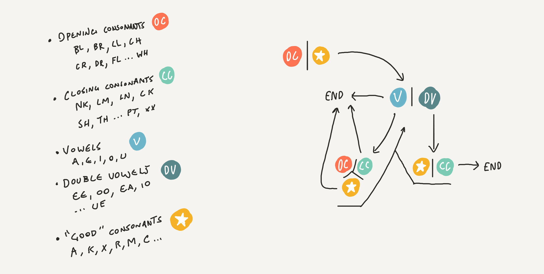
Generating the following code patterns
open vowel close
open double-vowel consonant
open vowel consonant vowel
double-vowel close vowel
double-vowel consonant vowel consonant
vowel consonant vowel consonant vowel
vowel open vowel consonant
vowel close double-vowel
vowel close vowel consonant
consonant vowel consonant vowel consonant
consonant vowel consonant double-vowel
consonant double-vowel consonant vowel
consonant double-vowel close
Don’t do what other apps do
Don’t follow convention when making an app. Don’t mimic existing apps that employ dark patterns (hey, Facebook Messenger)
Try to find the absolute minimum amount of data you need for your app to function, and then find the fewest, clearest words through which to ask for that data. Always respect “No”
Don’t make that “Skip” button tiny and the “Sign Up Now!” button big and bright. Maybe it works. But don’t do that. Respect the fact that your users make choices and don’t try to guide them to those beneficial to you. This shouldn’t be a controversial opinion
Because there are no analytics in Steps I will never validate whether any of the above were good decisions. Except that it’s obvious they were good decisions. Because they put you, the potential user, first. And us, the developer, last. That’s the way it should be
Editor’s Note
Simeon has made a deliberate decision to excise periods from the end of paragraphs. Please contact him if you’d like an explanation of his reasoning behind this.

